ALCHEMIX
ALCHEMIX serves as a cocktail recipe companion to curious and experimental home bartenders.
Project Overview
Challenge
Design a mobile experience that appeals to home entertainers and curious cocktail enthusiasts.
Deliverable
A recipe keeper that allows for searching, browsing, and curation of cocktail recipes.
Role:
Time:
Task:
Tools:
UX/UI Designer
5 weeks
Build a mobile ready application
Figma, conferencing software, Affinity suite
Research
The journey begins with independent research on existing methods of recipe exploration and conversations with curious cocktail enthusiasts. I wanted to know what inspired people to explore mixing cocktails at home, what methods they used to broaden their knowledge, and what limitations were present for those more reluctant to explore the creative art of mixology.
Key Findings
I connected with individuals to explore their views on drinking.
For most of my research participants, drinking was a social activity. The desire for mixing cocktails at home stemmed from a desire for more variety in consumption options and wanting to elevate the drinking experience.
“I could easily have beers or White Claws, but what impressed people more is having fun new beverages for people to try.”
With a desire to impress, users described not always knowing where to start. From not being sure what kinds of drinks they prefer to wanting to know what they can make with what they already have in their liquor cabinets, there seemed to be a bit of a learning curve for people who didn’t already have experience with bartending and drink mixing.
Affinity map of initial user research findings.
Themes Discovered
appreciation for social drinking
New to experimenting with various cocktail recipes
Desire to impress and elevate social gatherings
Desire to be creative
Having multiple sources to gather mixing information
Define and Digest
User Personas
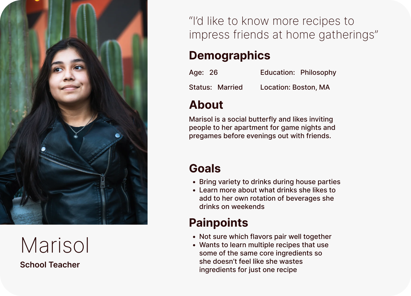
Armed with competitive research and synthesized user interviews I now introduce Marisol, my provisional user persona. She helps us to clearly define the problem we want to solve.
Marisol, amongst others, is looking for a way to diversify their knowledge of cocktails but isn’t well versed in where to start their journey of home mixology. They aren’t sure what goes well together, what they need, or how they can use their existing ingredients in the most impactful and delicious way.
Design
The Design Solution
ALCHEMIX provides a tool to inspire and guide users in their process of exploring new craft cocktails, giving folks the knowledge to bartend from the comfort of their own home with a large library of cocktails, step-by-step instructions, and note-taking abilities.
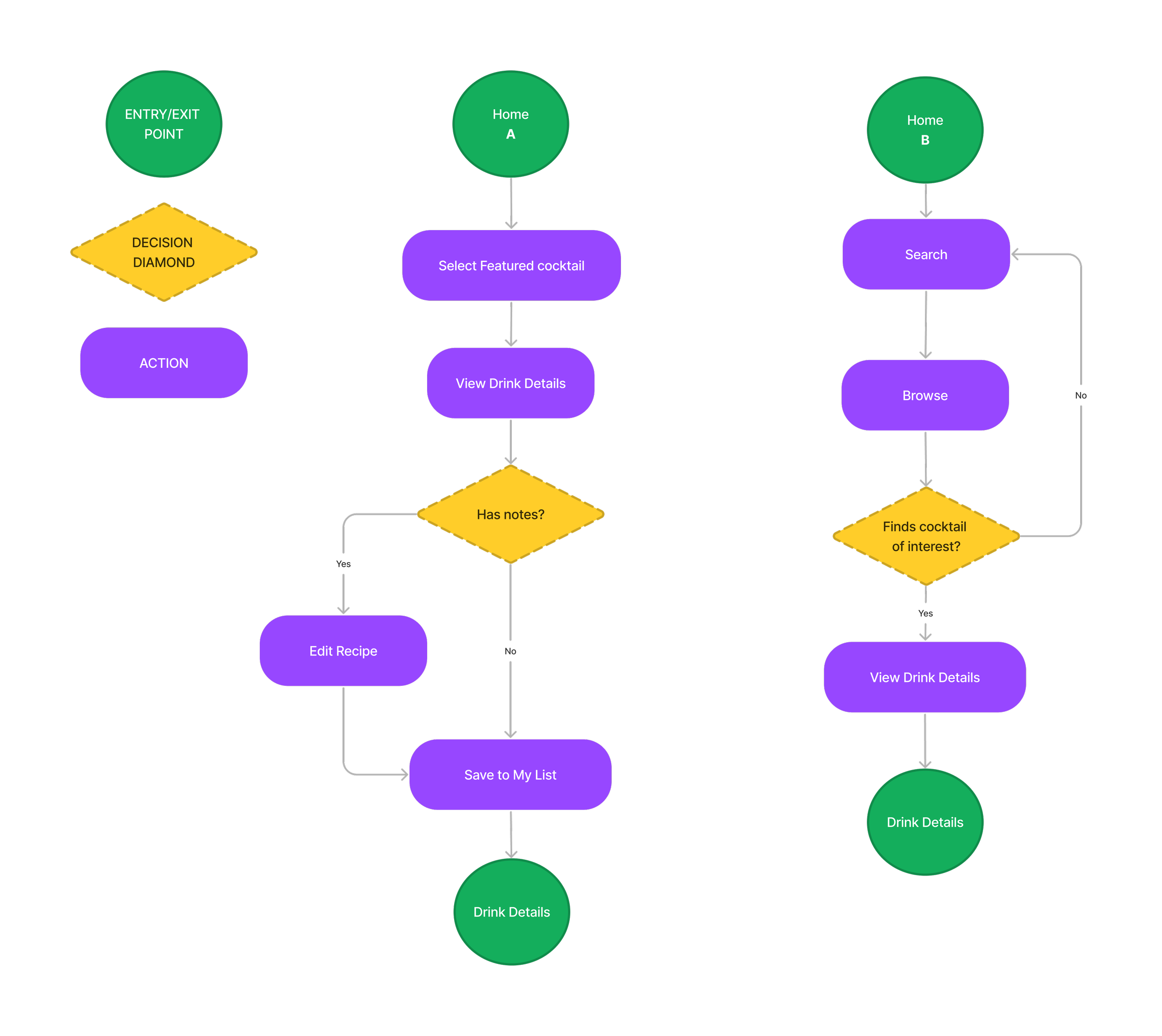
To communicate the visions, a site map and user flows were generated.
This MVP was focused on 3 core functionalities:
Browsing Ability
Search Functionality
Recipe Saving/Organization
Visual Design Directions
Knowing that users look at home cocktail mixing as a way to elevate an experience, I want the color scheme to reflect an elevated experience.
Opting for a darker palette gives the application a more refined and classy feel. Yellow, while a tricky color in the context of accessibility, with some fine-tuning CAN work as an impactful accent color. The combination of charcoal shades with the yellow emulates a darker bottle of liquor with its top covered in shiny golden foil.
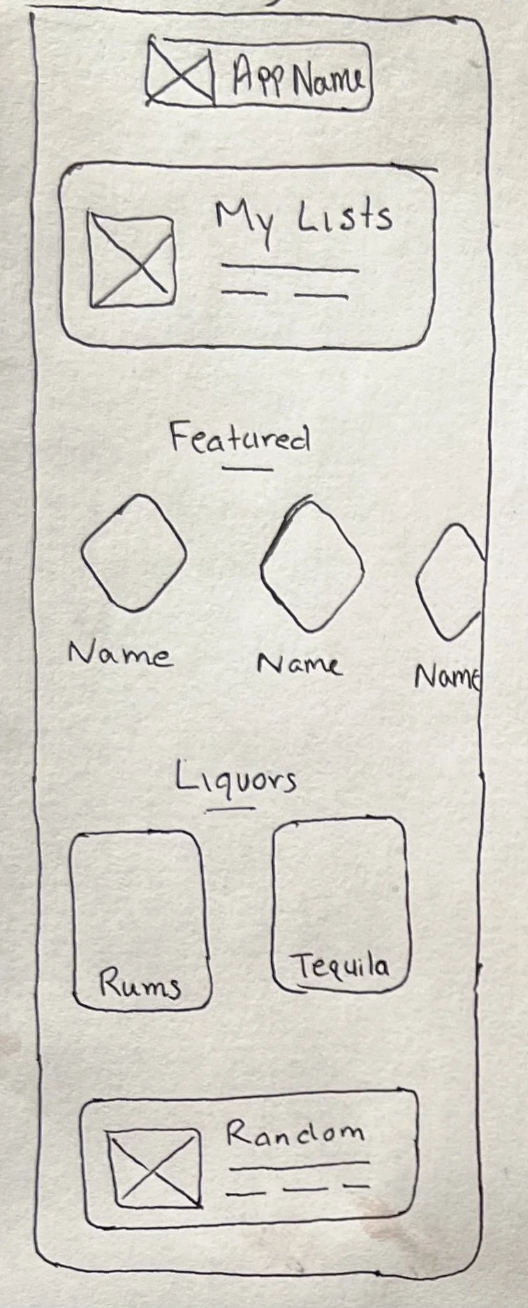
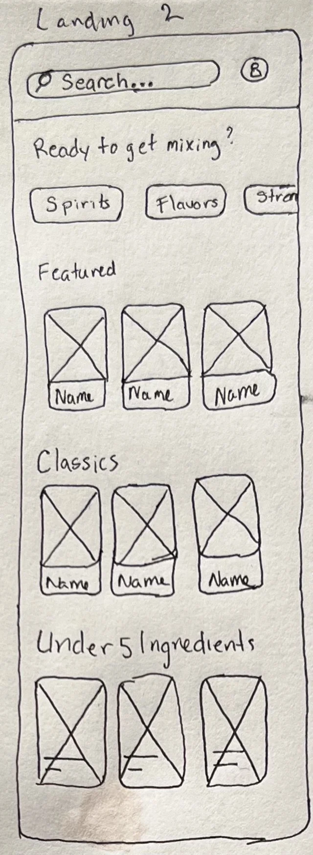
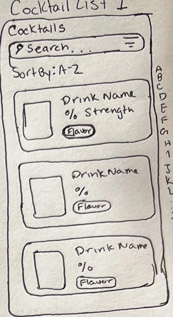
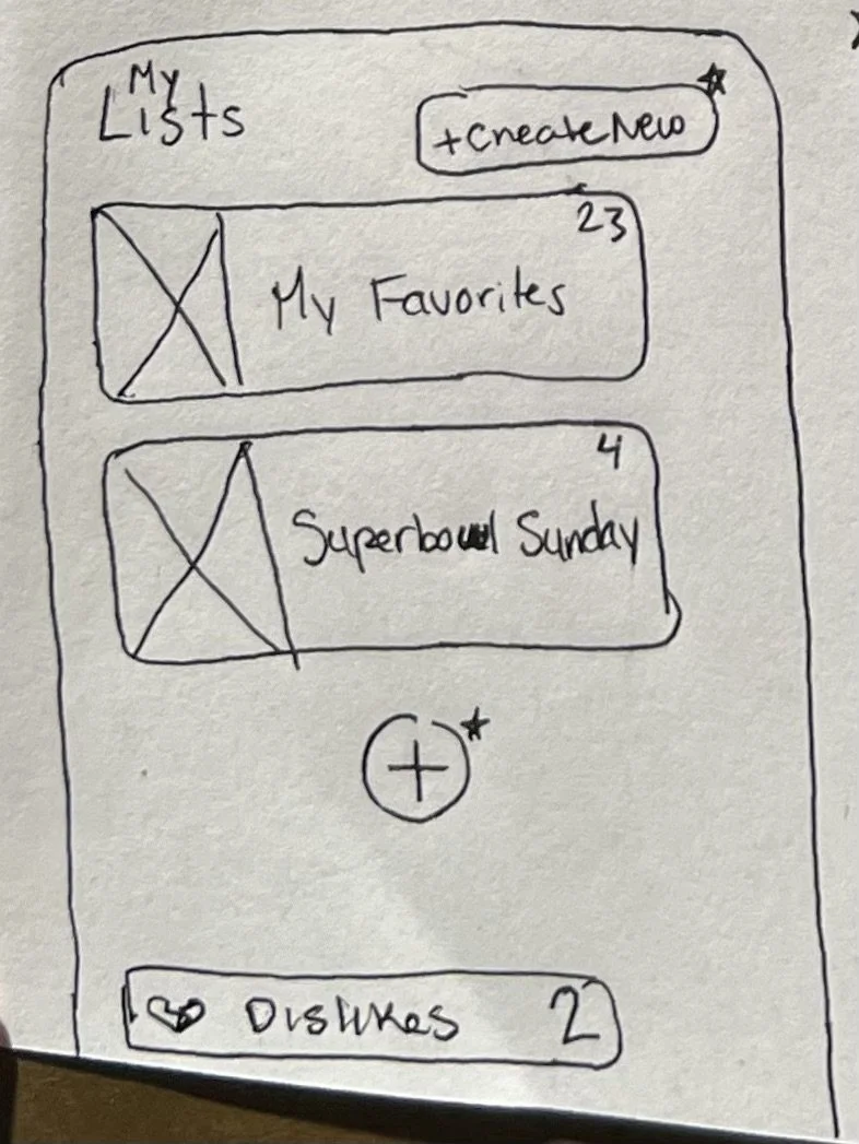
Low-Fi Wireframe Sketches
Keeping the user experience for Marisol in mind, I sketched out low-fi screens that addressed the user flows outlined above.
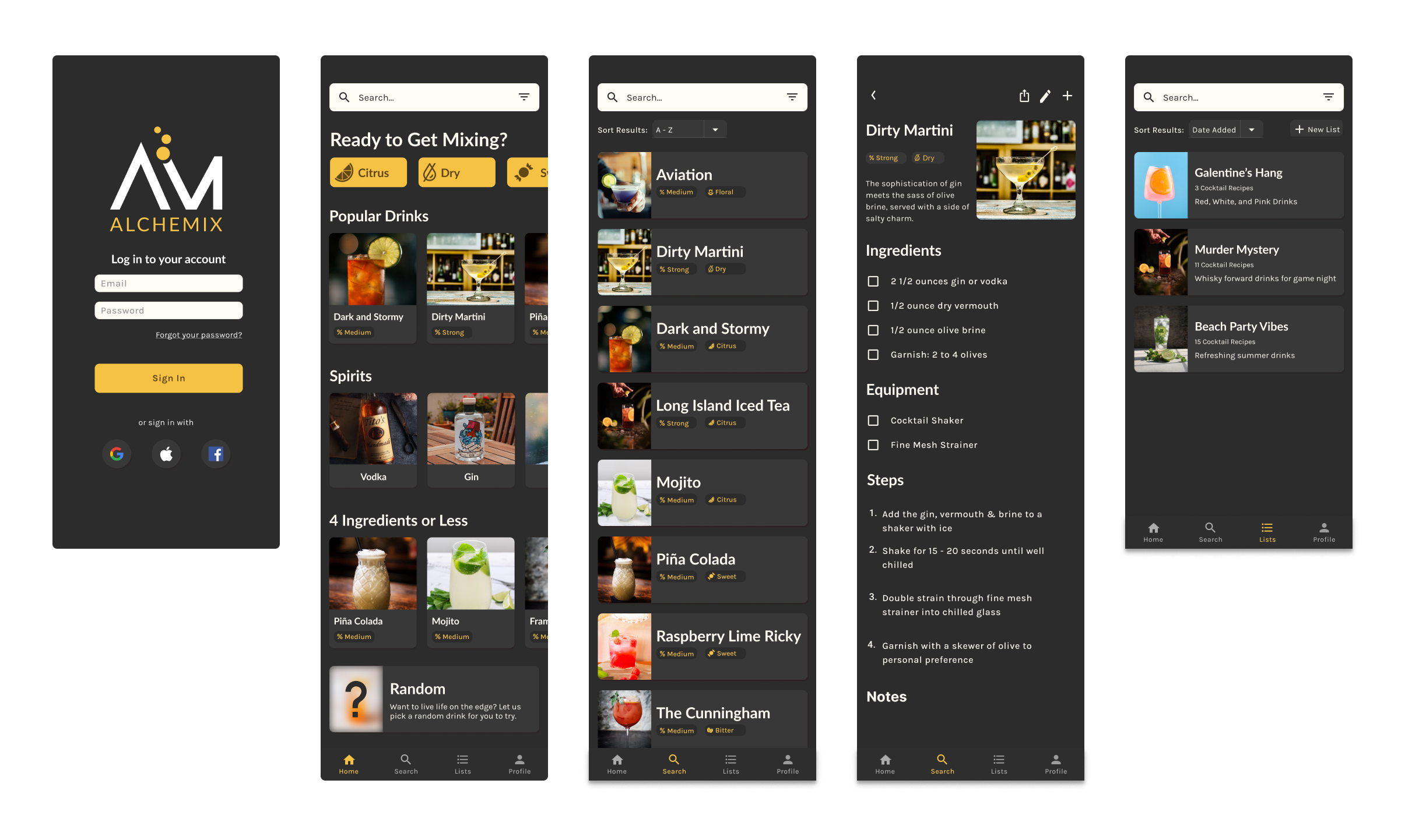
Moving forward, I converted my sketches into the first iteration of Hi-Fi prototypes. Below are examples of the screens.
Low-Fi Digital Wireframes
Testing
User Testing Overview
Method:
Age:
Duration:
Tools:
Task:
Remote, moderated testing
27 - 51
~15 minutes
Figma, iPad Notes, conferencing software
Completing MVP Task Flows
Pain Points
Upon completing the user interviews, I compiled a list of pain points experienced by my participants that I wanted to address for the final iteration of the high fidelity prototype.
Include the option to delete a step in the edit recipe view
Correct the length of the edit form fields
Add a View of recipes included in a particular list
Add 1 sentence descriptor on the recipe info page
Look over ‘flavor’ icons to ensure they’re uniform in size
Fix alpha sorting in recipe listing
Removing the sharing icon on the edit page
Fully transition to a ‘dark mode’
Design Journey
With my focus on the user experience, I iterated on my design. There is a dramatic difference, particularly with the color scheme. Here is a side-by-side comparison of two screens in version 1 and 2.
Final Design
These are the final screens for the ALCHEMIX prototype that addresses the core functionality we set out to deliver, with the addition of users’ ability to edit or save notes on a recipe.
Browsing Ability
Search Functionality
Recipe Saving/Organization
Editing/Note Taking Ability
Future Road Map
Future directions for further work:
Include a master ingredient list based on all recipes included in a custom list
Cocktail Search based on a ‘Fridge’ list, items a user already has at home


